
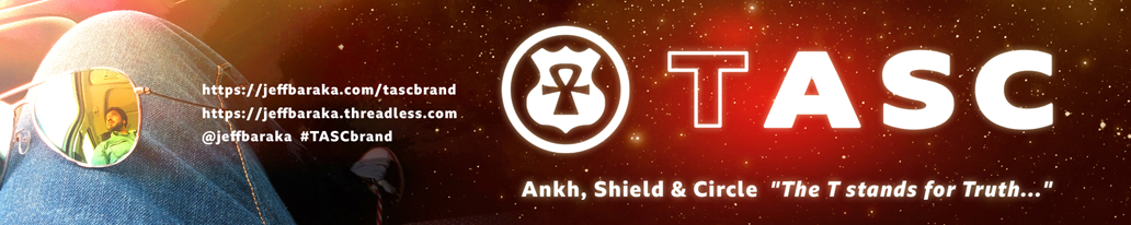
I designed the Ankh, Shield & Circle logo during my early hip-hop days as a “true-school”. MC/poet & beatmaker. It represents ideal synergy/harmony and “the road of life”. The Ankh —ancient Kemetic symbol of eternal life— is in place of a route number on the Shield of a US highway sign (think like the route 66 sign in pop-culture) and the Circle provides inherent symbolism of wholeness, karma and the sun. My original intent was to symbolize spiritual ideas of navigating one’s path to a best life and highest, most actualized self; and fulfilling one’s soul-purpose (becoming whole, shining).
But I later became conflicted about the Shield, when I realized I had to reconcile its problematic, broader symbolism beyond just a benign road sign. Concerned my original meaning would be overshadowed, I almost scrapped the whole logo. But after some thought, I arrived at a powerful, secondary interpretation: the Ankh emerging through the Shield represents tension, and the struggle to live —freely and fully— despite systems of oppression.
All the deep, esoteric meaning aside, I wanted to keep the design simple and circular for multiple applications, like my two main influences, the Bell Telephone and Public Enemy logos. In 2017, I refreshed Ankh, Shield & Circle (ASC) as its own streetwear brand, liberated from my infrequent music output. It’s since become the home of all my graphic designs for various activities (like TOWNIE, INTLPLAYER, and The #DownNow Project).
I had an epiphany in Paris in 2022, about ASC brand as so-called “workwear fashion”. That’s how the word “task”. came to mind, and how ASC brand was reimagined as TASC brand. But I didn’t change the logo, I evolved the brand story —The T stands for Truth, which isn’t always visible or obvious (especially when deliberately obscured). My TASC brand at Threadless shop is open (click the banners)… still just tee shirts for now, while I get to work…
